Difference
&
Repetition
by Tan Qian Rou
&
Repetition
by Tan Qian Rou
"Most architects don’t have a clue about fashion. There’s never very successful crossovers, creatively.”
Marc Newson, although blunt, cut right to the core of the problem during his 2014 interview with Dezeen. Newson’s primary concern may have been the quality of joint efforts within the output of fashion, but his statement surfaces a genuine concern: can architecture and fashion ever be collaboratively equal?
The intersection between fashion and architecture is a large one, fringed with culture and hesitantly populated by architect-conceived capsule collections, runway designs and carefully crafted store spaces. This is not to diminish the success or creative integrity of these ventures. We can hardly deny the mastery of Joseph Dirand’s store interiors, or the importance of architectural inspiration to the likes of Karl Lagerfeld and Rick Owens. The ranks of architect-slash-fashion designers have swelled to include Frank Gehry, one of the six designers for Louis Vuitton’s Monogram collection, and Zaha Hadid, whose fashion forays include pieces for Lacoste, Caspita and ‘architectural footwear’ company United Nude. But can we comfortably assure ourselves that these examples, amongst countless others, argue for the successful synthesis of architecture/fashion?
Gehry’s own statement about his Louis Vuitton Monogram bag says it all. “I have never been inside a handbag,” he ponders, “so I was trying to think what I would like if I was inside, I thought ‘maybe blue.’” A single glance at the handbag in question makes it indisputable: it is Gehry’s architecture, simplified, reduced in size, rendered in leather and cladded with Louis Vuitton’s monogram. Hadid’s footwear is similarly reminiscent of the sculptural planes of her buildings, her jewelry an offshoot of their organic geometry. Fashion becomes an afterthought, a new material for architects to play with.
Although less intuitive, the same holds true for Dirand’s store interiors for the likes of Balmain and Givenchy, and AMO’s design for Prada’s 2015 fall menswear runway. On their own, they are striking and certainly spatially interesting, yet strangely lifeless. As a discipline, architecture anticipates the activity it contains, but without the explicit presence of filled clothes racks or an endless procession of models, these spaces feel lost, just slightly less than architecture.
If this is the common trajectory of architecture/fashion, then collaboration is limited to description: this space is fashionable, this garment is architectural. We are reduced to reading one in terms of the other.
But to agree so easily would be to ignore the ultimate collision of both disciplines: the maison, the atelier and the flagship store. Not just spaces tailored to the retail of fashion, these are architectures which are shaped by, and in turn shape the character of a brand. These typologies present an opportunity for fashion houses to step away from the pursuit of retail or couture to accommodate other creative interests. Beyond the organization of space, they allow for the curation and cultivation of various programs ranging from galleries to laboratories, specific to their vision. Architecture affords houses the room to detach from traditional modes of practice, whether in creation, production or expression, in favor of innovation, reinvention and perhaps even experimentation.
If anyone knows the importance of experimentation, it is Rem Koolhaas. A vital figure in contemporary architecture, Koolhaas’s firm OMA boasts a long and varied roster of international clients. Out of the multitude, one of OMA’s most enduring clients is the Italian luxury brand Prada. For over a decade, Prada and OMA have maintained a close professional relationship. The architectural office’s research wing, AMO, has worked on numerous high profile projects for them, with the Infinite Palace Runway marking the latest milestone in the constantly evolving partnership. But this collaboration is far more complex and far-sighted than the occasional runway. AMO’s efforts for Prada span beyond the spatial to include catalogues and exhibitions, websites and ‘in-store technology’. Still, the most interesting of the OMA or AMO projects remains architectural. Prada’s firm belief that their image should be in perpetual motion and must therefore engage the cultural peripheries of fashion, along with OMA’s unconventional methods have resulted in a series of avant-garde spaces, most notably the Prada Epicenter New York. OMA/AMO’s description of these works state a goal of ‘research on shopping and new concepts for Prada as a brand’, an ambition that is constantly explored through joint creative output such as the highly experimental 2009 Prada Transformer pavilion.
This ambition pegs the OMA building as more of an outlier than the norm in the lineup of fashion/architecture. More traditional examples favor a subtle approach, which was the direction Renzo Piano undertook in his design for Hermès’s Tokyo headquarters. Maison Hermès sits on a street corner in the busy Ginza district, ten storeys of elegance composing a pair of elongated volumes. 13,000 glass blocks were customized to size, mirrored and textured by hand to give a translucency to the building; in the glittering heart of Tokyo, Maison Hermès glows like a lantern. Creatively and technically, it is a showcase of mastery befitting the Pritzker Prize-winning architect. Piano utilizes an innovated, flexible steel skeleton to detach the façade slightly from the building, a gesture which works in tandem with a kinetic structure to anticipate Japan’s seismic activity.
What is contained within is more conventional. A groundfloor store entrance is flanked by full-length window displays, dressed with Hermès’s quintessentially playful style. At eye level, the translucent glass façade is intermittently punctured with clear blocks, which delight passer-by’s with their colourful product displays. Otherwise, the building is a quiet fixture in the Ginza skyline. Perhaps more characteristic of Hermès are the frequent exhibitions the Maison houses, both in its double-volume exhibition hall as well as through the window displays. Designer Tokujin Yoshioka is one such alum, having curated the Maison’s store displays in 2004 and 2009.
Piano’s quiet approach may not be as programmatically innovative as Koolhaas’s Prada Epicenter, but it suits the subtle grandeur of the Hermès name. As much as an architectural consideration of the Maison cannot be complete without mention of Piano, it is similarly impossible to remove Hermès from the equation. Maison Hermès holds more depth than a physical expression of the spirit of the brand through its architectural qualities. By making a spatial commitment to Hermès’s patronage of the arts and frequently honouring that commitment, the Maison establishes itself as a vital entity both with the urban landscape and the art scene. The essential difference between Maison Hermès and the Prada Epicenter in comparison to any elaborate storefront is the potential within these buildings to be more than an orchestrated retail experience. They are able to engage and address fashion beyond the product, allowing both mediums to operate outside their usual restrictions.
Is this to say that architecture which is not ambitious above retail is somehow less valuable? If the image of a building is what embeds itself in our memory, is its nature then as superficial as its skin?
In spite of the creative synergy between Prada and OMA, aided by a personal friendship between Miuccia Prada and Koolhaas, the most identifiable Prada building is arguably its Tokyo Aoyama branch, which bears the signature of Swiss firm Herzog & de Meuron. Prada Aoyama sits, selfassured, in Tokyo’s most fashionable luxury district. Its confidence is justified; Herzog & de Meuron’s elegant façade design with its striking diamond-shaped glass panels cuts an irresistible, unmistakable profile for the store. At night, it gleams like a jewel against the dark sky.
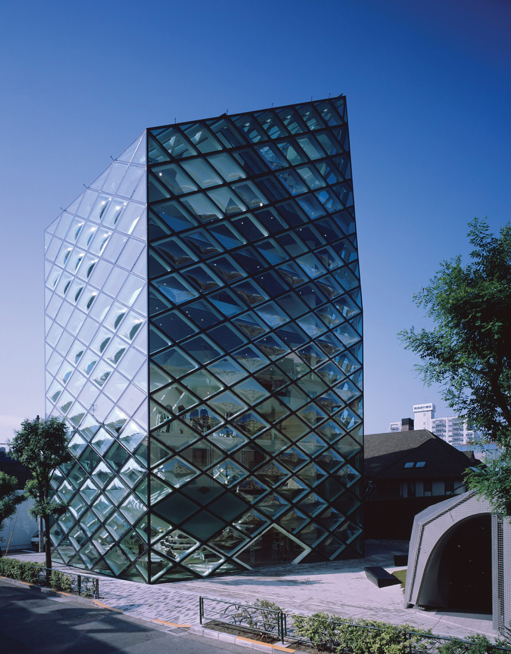
With the exception of the Prada Epicenter New York, Prada Aoyama might be one of the brand’s most radical examples of architecture. But while Koolhaas’s approach hinges more on the transformation of program—combining the retail experience with those of exhibitions and performances—Herzog & de Meuron’s innovation shines through their building’s diamond shell. The grid which accentuates the glass panels hides a structural shell system, supporting ceilings and floors from the exterior. Floor space otherwise cluttered with columns is now open to receive the light flooding in through a transparent façade. The open plan lends itself to countless possibilities in product display.
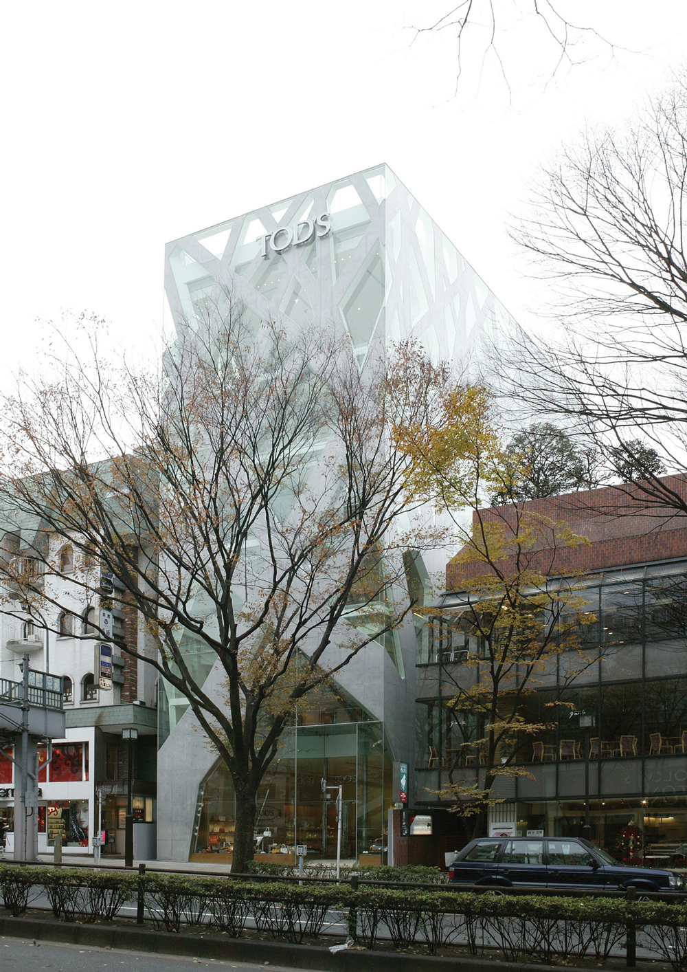
TOD’S Omotesando Building tells a very similar story. When its architect Toyo Ito was finally honored with the Pritzker Architecture Prize in 2013, TOD’S Omotesando, built almost a decade prior, was cited as a representative work. Ito was applauded for the unconventional use of concrete and glass, two drastically different materials, in redefining the traditional structure and mass of a wall. Concrete branches up the façade, mimicking the few trees within the area. Counterbalanced with glass, the solid concrete veins simultaneously define, yet draw a relationship between the lines, surfaces and openings of the building. The resulting effect seems intuitive and casual, but Ito’s prolonged consideration of the concepts manifest in TOD’S Omotesando is clear; his 2002 Serpentine Gallery Pavilion explores a strikingly similar form.
The general public’s image of Prada Aoyama or TOD’S Omotesando Building is more persistent than that of Prada Epicenter New York. These buildings, captivating in form, become visual statements that endure beyond their architectural merit. Conversely, their architectural excellence perpetuates the longevity of their fame. When it is not explicitly manifest, fashion seems to defer, stepping back into the role of the client instead of collaborator. But the architect/ client relationship is not without circumstance. When Prada and TOD’S hired their respective architects, it was with an understanding of the gravitas of their star reputations. The transaction was not for architecture, but for quality architecture, to which Prada and TOD’S could adhere their brand names.
Perhaps they are not quite examples of synthesis, if synthesis were to be primarily defined as the combination of method and medium. And while their methods vastly differ, fashion and architecture still share common goals, both criticizing and reflecting socio-cultural issues through creation. Still, Prada Aoyama and TOD’S Omotesando represent an important step in the process, where architecture in itself is recognized as a valuable endeavor, and fashion houses acknowledge this with support. In return, the brand’s name is enriched and their cultural context expanded; after all it is easier for a fledgling house to explain the necessity of a building than it is to justify an art collection.
But it would be naïve to assume this relationship is a simple one. Architecture does not simply bear a name, in some way it is burdened by it. Just as certain functions are attached to programs—a bakery produces baked goods, a hospital heals the sick—architecture must serve both image as well as more mundane duties: storage, shop space, offices. This is why Gehry’s latest claim to fame, the Louis Vuitton Foundation, is a curious case. Commissioned by Louis Vuitton’s parent group LVMH, the Foundation presumably serves as a cultural voice for LVMH and its subsidiaries in proclaiming their patronage of arts and culture. Recently launched, the Tod's Omotesando Building in Tokyo museum is painfully Gehry: extravagant and visually complex, if somewhat derivative. Some have taken to calling it a fish, or a whale, or a ship, referencing its leviathan, curved glass form. Hanging above the ticket booth amidst all this glass and cut in stainless steel, the Louis Vuitton monogram reigns unchallenged.
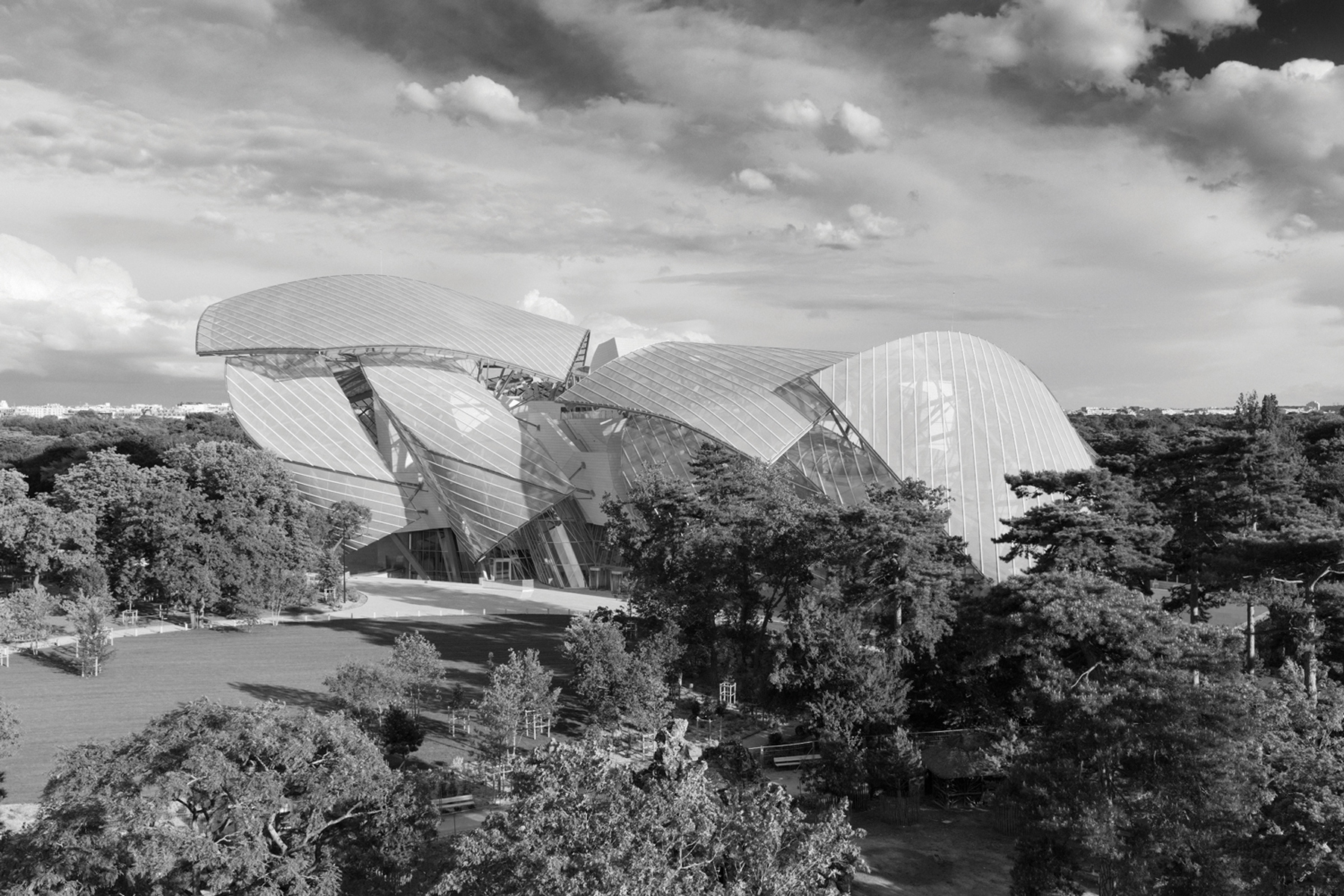
That it is named as it is seems puzzling. While Louis Vuitton is the flagship of the LVMH brands, the Foundation is run strictly as a non-profit organization, legally separate from LVMH’s commercial interests, which of course includes Louis Vuitton. The building itself will only remain in LVMH’s possession for fifty five years before being handed over to the Parisian government. And as if this relationship couldn’t be any more tentative, only Louis Vuitton’s S/S 2015 collection explicitly joins building and brand, the former having once served as a runway. Through a superficial attachment of the Louis Vuitton name, the art and architecture positions itself behind a lens of the fashionable. As a privately funded establishment which will eventually be made public, the Foundation is admirable. But as a museum, the Foundation falls short of expectation. As with most Gehry buildings, critics will be perpetually locked in struggle over its success as architecture. And as with most museums, the general public will be wondering if there needs to be another one.
What we should be wondering is why the dissonance between the Foundation and its press image is not only present, but so apparent. While no one can truly assess LVMH chairman Bernard Arnault’s intentions, it is not radical to position the Foundation at least partway as a deliberate move in enhancing the corporation’s image. The commissioning of a building completely unrelated to Louis Vuitton’s brand interests beyond a vague ‘artistic vision’ is almost patronizing; it reads as an attempt to promote culture without actually making much effort to provide it. The housed collection is trendily avant-garde. Gehry’s architecture is predictably stunning, but hardly innovative nor surprising within the larger canon of his work. Nothing is controversial enough to illicit more than affable affirmation.
Even as an example of architecture, although the Foundation technically serves the same purpose as Prada Aoyama or TOD’S Omotesando, the Foundation’s key error is in promoting Louis Vuitton without architecturally addressing the spirit nor vision of the brand. This renders the gesture meaningless: nothing of value is created, and the disparity between statement and outcome is obvious enough to undermine any efforts. Still, while the Foundation may be cast in concrete, however literally, LVMH’s practices are not. Whether their approach will change in time to come is still an open question, one that will most likely be answered at the end of LVMH’s fifty five year stewardship.
French philosopher Gilles Deleuze argued that true creation occurs not through a combination of different material, but the collision of language. All the stories we have spun from language are clichés, repetitions of the same dreams in different words. Rather than the outcome, Deleuze believed that it is the process that must be examined and altered. Similarly, it is not whether architecture/fashion can be creatively equal, but how this synthesis should occur. A commitment to experimentation, which in turn seeks creation through methodology, is absolutely vital. Only by pushing both disciplines to their natural limits can we hope for newness, a true act of discovery. Not to reframe what we already know, but to show us what we never knew could exist.
