In this age of technology, genericness is a disease. It spreads like a virus, until our social media is image-heavy with it, our cities bloated with identical storefronts and our bodies stuck in a Sisyphean nightmare. The ease of replication, coupled with globalisation, creates a marketing strategy of practised repetition. International brands differ to a carefully curated visual and spatial identity, executed by local employees such that each specimen is nearly indistinguishable from another. The omnipresence of the Internet and the dimensional limitations of image strips these repeated spaces of any physical meaning, encouraging the spread of genericness.
This is not to say that all global brands are given to genericness, or even
intentionally practice it. But the reality of economics and corporate hierarchy means
that this is an easier, less expensive plan for expansion. Rare is the retailer who
considers each of their locations in terms of architecture rather than potential
income. Those with the financial capacity, such as luxury houses which prize
creative expression, come to mind as examples. But of these retailers, the name
which most appears most frequently is that of skincare brand Aesop.
Founded in Melbourne by Dennis Paphitis nearly 30 years ago, Aesop has since
expanded beyond its native Australia to include concept stores in 13 other countries.
Characterised by a dedication to detail, aesthetics, scientific approach and the
importance of experience, Aesop’s skincare products have achieved plaudits for in
both form and function. Naturally, this philosophy extends to the design of their store
spaces: each Aesop location is carefully scouted, considered and designed in
collaboration with selected architects. Amongst these illustrious few are Paris studio
Ciguë, UK-based JamesPlumb and international firm Snøhetta. The Aesop
philosophy holds local tradition in high regard, leading to beautiful examples of
architecture which liven up their urban landscape. Working on the storefronts for
their more recent Japanese expansion is a local rotation of designers, including firms
like Schemata Architecture Office, Simplicity and Torafu Architects.
Jo Nagasaka of Schemata took the lead, constructing Aesop’s first Japanese store
out of reclaimed local timber in the historic district of Aoyama. By all accounts, Aesop
Aoyama is the result of multiple efforts: an address hard-won by local staff, the
incorporation of new and old materials in reverence of Japanese traditions of
wabisabi, and intense creative collaboration between Nagasaka and Paphitis.
The product is a sophisticated, warm atmosphere, accentuated by the open facade.
A single rack of tester products invites the curiosity of passers-by. Resin coats the
original floor, filling in defects and creating pockets of surprise. Utilising raw wood
reclaimed from a demolished house, Nagasaka’s intervention highlights the skeletal
remains of the store’s previous life, evoking a sense of material curiosity and
reverence for the locale's history.
As a precedent for Aesop’s subsequent locations within Japan, Aoyama set the
standard for spatial quality and close cooperation. Headed by Koichi Suzuno, Torafu
Architects has designed multiple Aesop locations across Japan, each one reaffirming
the unflinching attention to detail apparent in Aoyama. Speaking to Suzuno at
Aesop’s Tokyo headquarters, it quickly becomes apparent just how involved Paphitis
is with all aspects of the design. Towel sizes, material palettes and paint colors
dominate the constant conversations between Suzuno and Paphitis, involving no
small number of samples, swatches and frazzled postmen.
In spite of Paphitis’s close involvement and the strong object identity of Aesop
products, Suzuno feels no restriction in his freedom to design. Visual merchandising,
material restrictions and brand guidelines simply become part of the architectural
parameters. Each of Suzuno’s stores in Tokyo Midtown, Kawaramachi, Ginza and
Shibuya—to name a few—feels properly located. Aesop Ginza celebrates the
district’s famous brick streets. Shibuya playfully subverts spatial expectations
through specific elements. Aesop Kawaramachi combines historic references with
vernacular material to great experiential effect. Fundamentally, Suzuno says, his
collaboration with Aesop intends to create a pleasant and unique sensory experience
for the customer. In the age of e-commerce, he notes, physical presence becomes
valuable. This philosophy echoes Aesop’s own with regards to their products, where
the process of use is as important as the function itself.
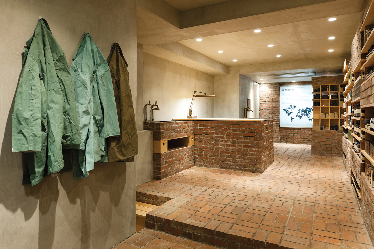
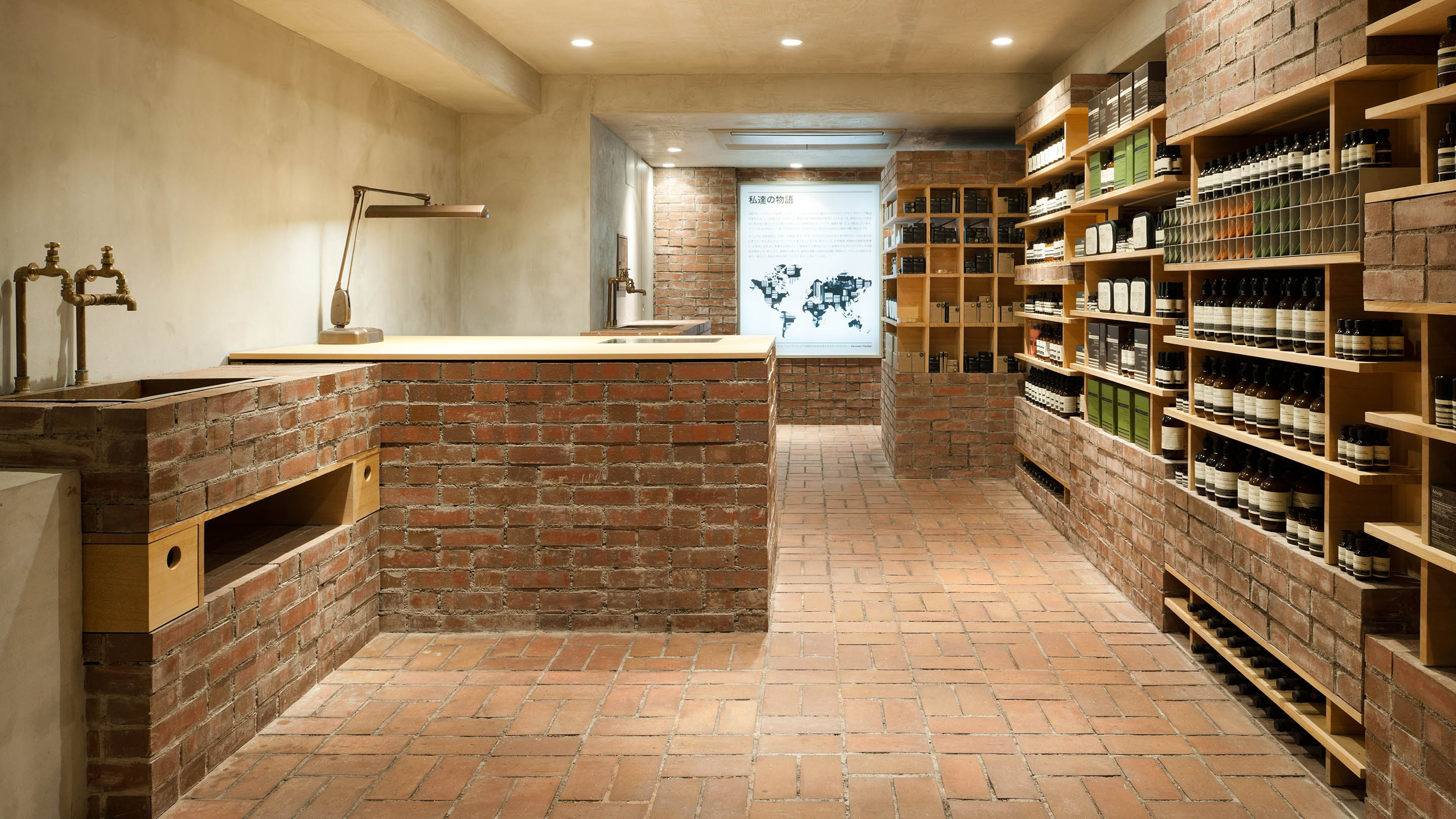
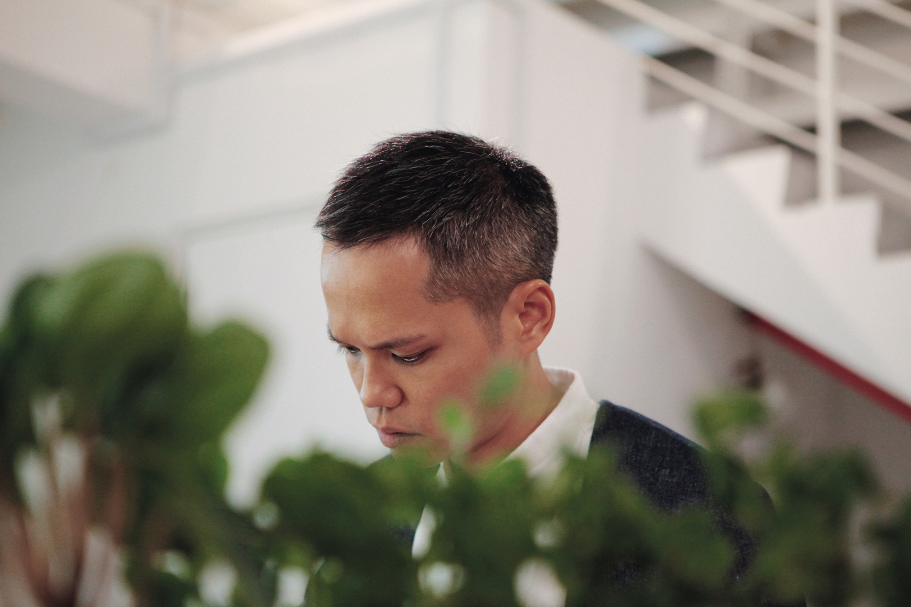
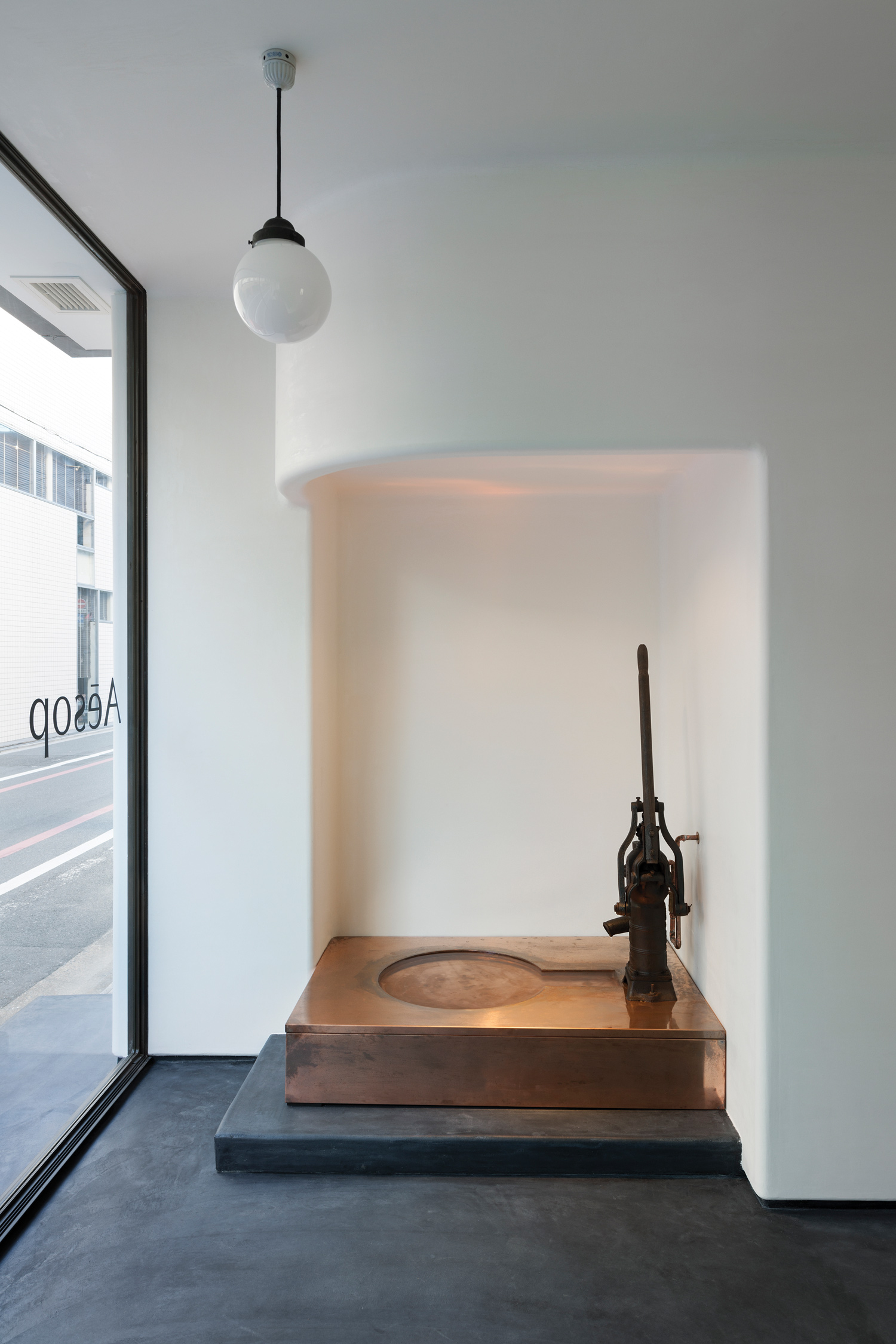
In some manner, Aesop’s brand philosophy is Paphitis’s own. Or, at least, conversations with Simplicity’s Shinichiro Ogata seem to conflate the two. Perhaps this is informed by Ogata and Paphitis’s deep, personal connection. Paphitis courted Ogata as a friend before an architect, the two men forming a mutual understanding and respect in spite of their language barrier. This explains the choice of location Paphitis entrusted Ogata: Kyoto, a historic city with strong cultural roots. Kyoto is an important location for Aesop, as well as for Paphitis, who is personally enamoured with its richness. The invitation came in the form of a prolonged email exchange of songs, images and text between the two, which Ogata delightfully describes as a ‘love letter’. And unlike with Nagasaka and Suzuno, Paphitis was barely involved in the actual design process of Aesop Kyoto, leaving the project primarily in Ogata’s hands. Ogata attributes this to their synchrony of perspective; for Ogata, designing an Aesop storefront is immensely comfortable because he understands Paphitis and therefore Aesop. What Aesop Kyoto embodies is evidence of this: a distinctly Japanese storefront, inspired by Junichiro Tanizaki’s In Praise of Shadows, vernacular machiya town-houses and Japanese script. Along a secluded street, the store exudes a quiet elegance. Ogata’s investigation of the use of traditional craft to express a quintessential Japanese quality in contemporary architecture harmonises both aesthetically and intellectually with Aesop’s practices, conceiving a truly breathtaking spatial quality unexpected of retail spaces.
The creative alignment of Ogata and Paphitis may be eminently rare, but Aesop’s meticulous and considered approach to design is one shared with all its architectural collaborators. And for a brand whose product design is so iconic as to sometimes be pirated, a measure of wariness is justified with regards to the architectural character of spaces fundamentally programmed to sell these products. Genericness would be easy, articulated through a visual grid with racks upon racks of hand balm lining the walls. One might think that Aesop’s guidelines for material swatches, towel dimensions and sink placements would induce exactly that. But when the architect-client relationship is one of collaborative synergy rather than subservience, the space develops a character unique to that process.
Suzuno remarks that he finds it interesting how each Aesop store worldwide reflects the personality of its architect, which distinguishes them far beyond the genericness of guidelines. For fans of the architectural discipline as well, Aesop stores are gems of craft, conceptualised by the most creative designers and delightful in their refinement. It all boils down to this: Aesop’s uncompromising rigour and utmost dedication to experience simply does not allow for the consideration of the generic. Built with sincerity, their architecture cannot help but reflect these intentions in the smiles of its users.
