Principle of the Matter
by Tan Qian Rou
by Tan Qian Rou
Consumerism thrives in the digital age. When virtual accessibility is so pervasive in our culture, the world is literally at our fingertips. The physical distance of space is increasingly irrelevant in our consumption of thoughts, products and design. As our visual intake teeters on the brink of oversaturation, our tendency in product consumption veers towards trends, aesthetics and statement. Function becomes secondary; or perhaps it is more accurate to say that function has mutated to encompass the articulation of fashion and lifestyle.
In an era where the object is almost overburdened by so many demands, London-based designer Paul Cocksedge’s subtle elegance and witty approach to design provides much-needed respite. The natural tendency is to describe Cocksedge as innovative, experimental and technologically focused. While not entirely inaccurate, this branding and even Cocksedge’s portfolio suggest a focus on the physical, a design methodology that centers itself around material properties and the resultant innovation of form. To fully grasp the significance of Cocksedge’s design, we must cast away the most instinctual of notions: that in design, the object is imperative.
If a deconstructed approach is perceived in Cocksedge’s design, it is because his emphasis is on showcasing concept; the physicality of the object is a condition of creation. If his span of work seems wide and varied, it is because he does not limit his interest. Cocksedge reiterates the importance of the human response in design, a belief he articulates with great nuance. His pieces contain a layered, quiet intelligence, provoking thought based on instinctual curiosity and human experience. And after all, what is the purpose of design, if not for the people?
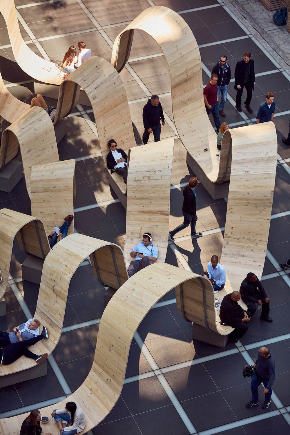
A major feature I see in your work is a sense of curiosity; you’re very curious about materials. So, in that, what is the philosophy you have, towards the treatment of materials?
Its more ideas. Materials are just one part of it. I’m more interested in ideas and really doing things. And materials are important, and of course, play a part in it, but it’s the words, it’s the complications, it’s the reasons why you’re doing something (that are important). Materials are almost a secondary point.
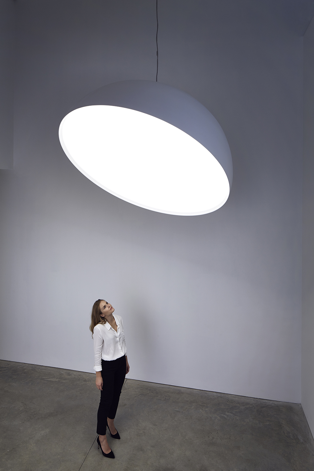
From looking at your lighting features… In particular, Capture was quite poignant. Would you agree that you see light as a material in itself?
Yes, completely, 100 percent. I mean, if I could have got rid of the object, and just had light itself, it would have been ideal. Capture is an example of that, to kind of deconstruct the infrastructure around light, and the lamp, and just got rid of everything apart from light, really; we have a hemisphere, a very simple form which is quite pleasing to the eye, not too complicated. In a world of so much complexity and visual overdose, sometimes it’s good to take things away, and not show things, and kind of strip it back to the essence. That’s always quite exciting.
I think that Capture is interesting for me in a sense that… I think that light doesn’t belong to anyone. It’s everyone’s. And the beauty of Capture is that it doesn’t belong to me at all. It’s light. You can’t say, ‘Paul did a great job with this piece, he makes really beautiful lights’, because it’s not the case. I assemble these elements together, but I think the most beautiful thing is light itself. It’s everyone’s, which is really beautiful as well, in a world where everyone is obsessed with owning things.
So, would you say it’s actually more a way of showcasing light, which is so pervasive in our everyday lives that you don’t really internalize it in thought?
Yes, completely. I think a lot of people encounter light, artificial light in very confused way. Objects, lamps–if you’ve ever been to a lighting fair, I’m not sure how you feel, but I want to run away. There’s so much confusion there; it’s not about light at all, it’s about adding more stuff around light. Light is almost the secondary part of it. There are some designers out there who do such beautiful work with light, and really understand it, and connect with it. ‘Collaboration’, that’s the important word here, people collaborate with light, they don’t steal the show. When they steal the show on light, it’s a shame, because you can’t really beat it.
Ok, on a tangent, I saw that in your solo exhibition you also have the application of your ideas (about light) to architecture. Do you see a collaboration happening anytime soon?
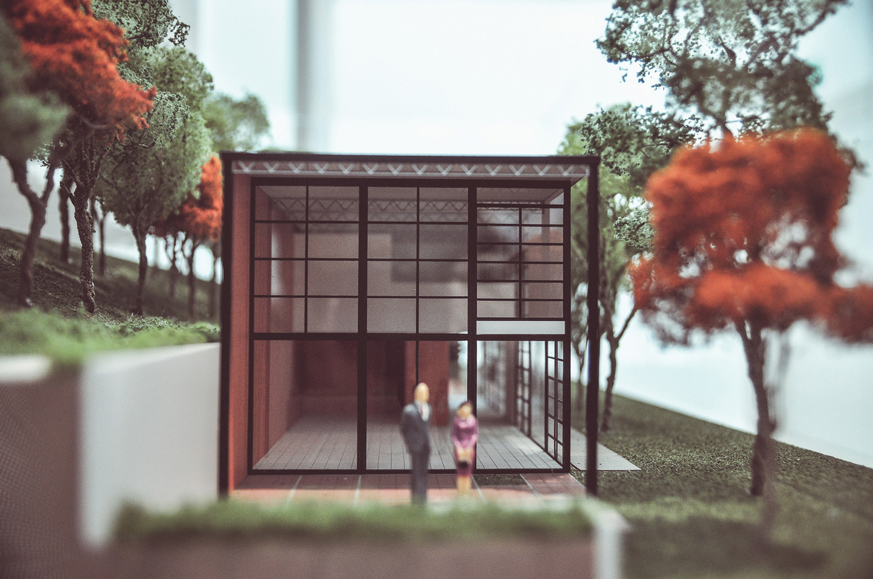
We’re trying our very best. The models were glimpses of new possibilities; quite ambitious work, but very possible. I’m getting to a point where it would be fantastic to have permanency, to have spaces where people can enjoy. I find that objects are sometimes quite limiting, they end up for just one family, or one person, or even never, for anyone. They just appear on blogs, and magazines, and no one ever buys them because they’re not even produced, and I find that quite limiting.
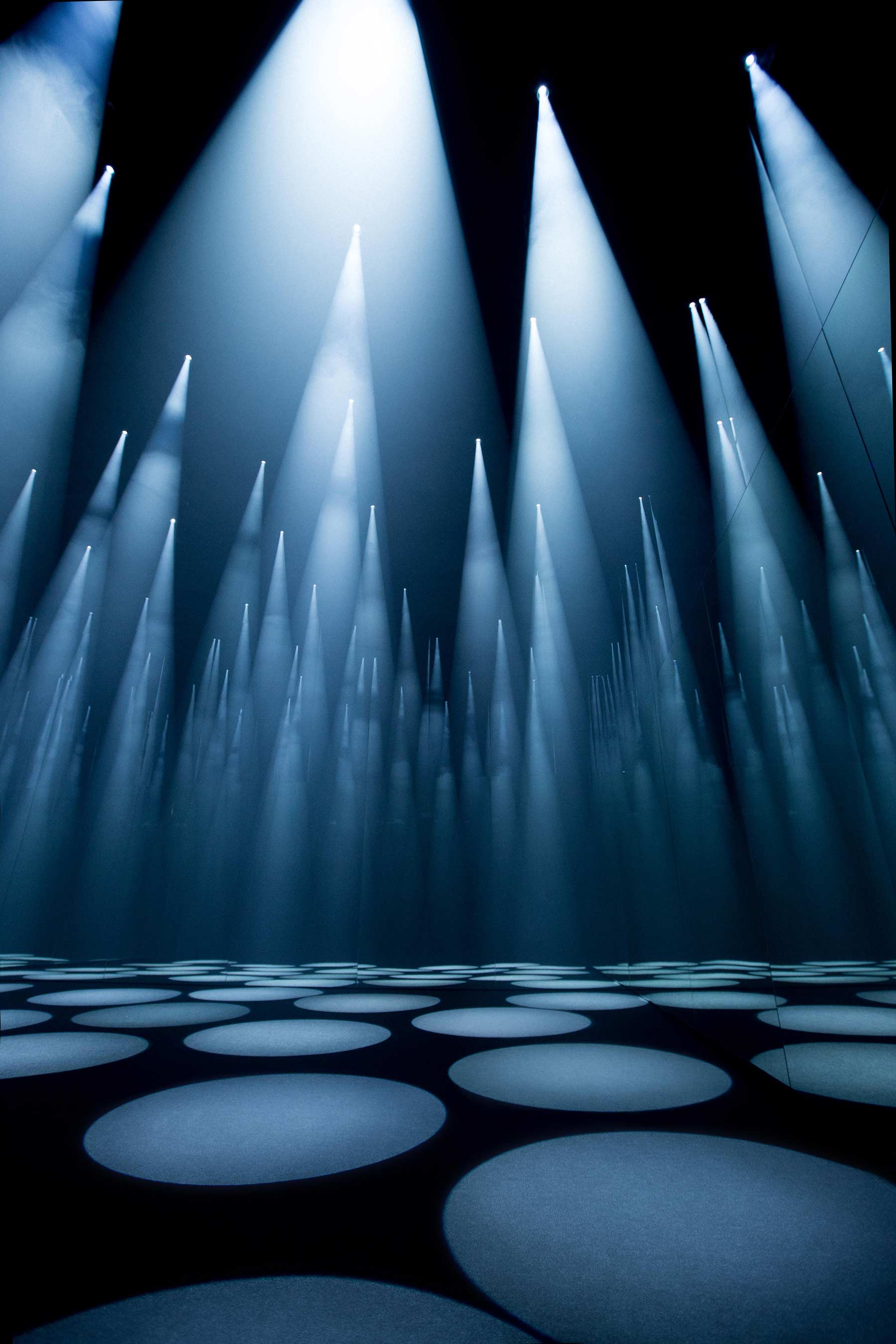
The feeling of changing scale and moving into architectural work… Bigger, more public, things that have to last, things that are beautiful, things that have to connect with people’s souls and lives… The idea of connecting with more people is very important. And the works that I showed, in the gallery, the idea of light and deconstructing light into different colors and reassembling them… I very much enjoyed thinking about a space without a particular function, but actually at the end of the journey the function became clear, which is quite interesting.
In a lot of designed spaces, the purpose of the space is set. The way I worked was to think about how light can behave within a space: that was the beginning. The function of the building wasn’t even a consideration, but actually, on completion of the work… Then you can imagine, because it is a celebration of light, color, science and physics, you start thinking, could it be a university? Could it be a chapel, could it be an airport… The function of the space came only after that.
So really, for you it’s about exploring the idea and the concept.
Yeah, it’s the idea. My idea was to collaborate with sunlight. How I do that is a secondary point. The starting point is the words, the motifs, the reasons. Material is out there. If you use them, don’t use them, that’s fine.
And that also applies to the table that you just came up with, Poised?
Yes, the table’s an interesting project, because I was exploring failure. I was just exploring the idea that a table could fall over. Which is quite ridiculous, really, because I would go out of business, if my idea was to make things that fail, but I was very excited about working in this territory of failure; how to make something look like it’s not going to work, and then explore the limits of that as an idea. And failure was a massive part of it. There was a lot of failure. This project took maybe a year… Over a year to calculate. What was fascinating for me was that at the end of it, we ended up with a table that is completely stable. I think this is quite interesting, in that sense, in starting this way.
But it’s a gallery piece. If you go into a gallery and you see something which you think could be mass produced, that doesn’t really sit comfortably with me. I was exploring this idea of failure, so I had to collaborate with physics, and center of gravity, and how heavy this object was… The object ended up 500 kilograms, which is extremely heavy. So it became this object that deserves to be in a gallery environment; it’s not a mass produced object, it wouldn’t make sense to. The thought process behind that was about pushing limits and not being scared about the practicalities of mass production or anything like that. It was a pure sort of thinking, in a sense, focusing on that one single idea and trying to make it work.
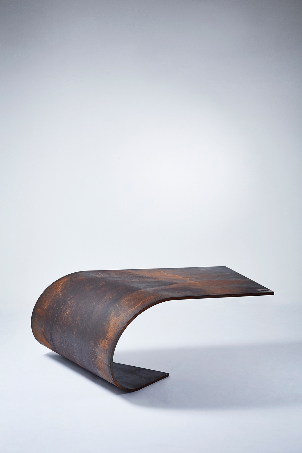
The idea of working from failure is quite intriguing because the end product tends to be something that invokes curiosity in a viewer; we have all these preconceived notions of a table, and when they look at it, with the steel and the shape of it, it starts a thought process. And this occurs with a lot of your pieces… Like Veil. How important is this relationship between the designer and the audience, this instillation of curiosity, in design?
For me, it’s vital. The people, they complete the work; without the people, it’s nothing. And I think there’s a lot of design I see, where people get in the way of the piece. People can get in the way of creation, and I think that’s a real shame. I think design has to be for people, and what I’d really like to do in the work is make sure people complete the work. This is why this idea of buildings, spaces, permanency is important because people are more involved in that process, and this is shared by many.
With regards to one of your pieces, the invisible bookshelf, one question that comes up is that of what exactly the consumer is buying. Because of the (unseen) nature of the bookshelf, I think there is some confusion as to the point of the piece, when bookshelves that are aesthetically pleasing as objects and inherently functional exist on the market, at a lower price point.
Hm, I find that so funny, that people worry about something like that, paying too much money for something they can’t see. It’s so absurd. (The bookshelf) was about removing the object, taking it away and leaving the function. And it’s a very functional object. It’s also a twist on perception; you see these books… But where is the object? People are obsessed with objects.
It’s about removing the object and celebrating function, and I think that’s wonderful. Why can’t you just buy function? Why do you need an object? To be honest, I think a flat piece of wood with two hinges on the wall is more complicated than my proposal. I think it's ok. I’m very happy with that. And the people who complain, they only complain because they didn’t buy one, I think.
I think what I wanted to do was celebrate the books. Celebrate the sculptural quality of the books, and play with it. Make them look as though they’re on the edge of falling. I have one in my house. People come in, they smile, it’s a talking point and it’s engaging and it moves beyond the object. It becomes a discussion, and… Why not? Why not have a discussion and make people think? It’s interesting. It’s not an object; it’s a piece, in that sense.
Yes, definitely, and we find all of your work interesting that way, that they create a dialogue about different aspects of the ‘object’, that you don’t consider. So let’s move on from that; I notice that for pieces like Change the Record and Volume, and also A Gust of Wind, Bourrasque and the paper tray, there’s a similar form running through all of them, in an iterative design sort of way. Is that an intention you had? To improve upon or look at different aspects of a previous item, a previous concept?
Not necessarily; A Gust of Wind, Bourrasque, the Paper Tray, they’re celebrating the form, of paper, so they just appeared in different directions. And my table started from paper as well. I think that the way paper behaves, the way it generates curves is very natural; it’s very unconscious, in its way of creating shape. You can sometimes go to curvy and kind of controlled, and then it’s much more about the designer having complete control.
And I think the beauty in paper is that you take a piece, and you curl it from any angle, and it creates beauty for you. Just a single force in any direction creates shapes. It’s simple, I understand it, it’s pleasing, to me and I connect with it, so I celebrate that, with all of the pieces that look paper-like.
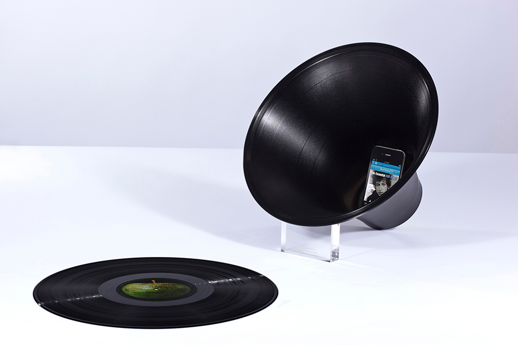
With Volume and Change the Record, this is different, it’s about acoustics, it’s about reusing materials, celebration of reuse, and it’s a little edgy… These records, they’re about to be destroyed, so we take them and we cook them, we stretch them (to make the object.) With Volume we flip that around and create one that is completely transparent and suspended, just to have a completely different feeling. You just have to play, and enjoy the process, and I like doing that.
And I do like materials; Change the Record is a celebration of material. I could have used any plastic, but I chose a record. A record has got so much history, so much embodied into that object, and I think using it in that way is making it technological, making it functional in a different context.
Ok, just one last question before you go. You use the word ‘celebration’ a lot, when you say celebration, is it also looking at products that have been designed, and looking at new products that may interact, or reinterpret them?
Yes.
That was straightforward.
You know, my mind is very full at the moment, there’s a lot of different projects happening, and it’s exciting, there’s different scales, and electronics, and buildings, and furniture, and we’re doing staircases… It’s a really exciting time.
For me, this is what design is all about. It’s about being led by ideas, not feeling restricted to one discipline, and trying to please people along the way. And there’s always going to be people who criticize and judge things; that’s fine. That’s part of it, and it’s important. Like I said, it’s about people, and people’s responses have an effect on us, as a studio, because ultimately the ending of the thing is about people. I think people should just… Realise it’s about doing good work and making useful things and useful spaces, and they complete it, that’s the most important part.
It's about people.
