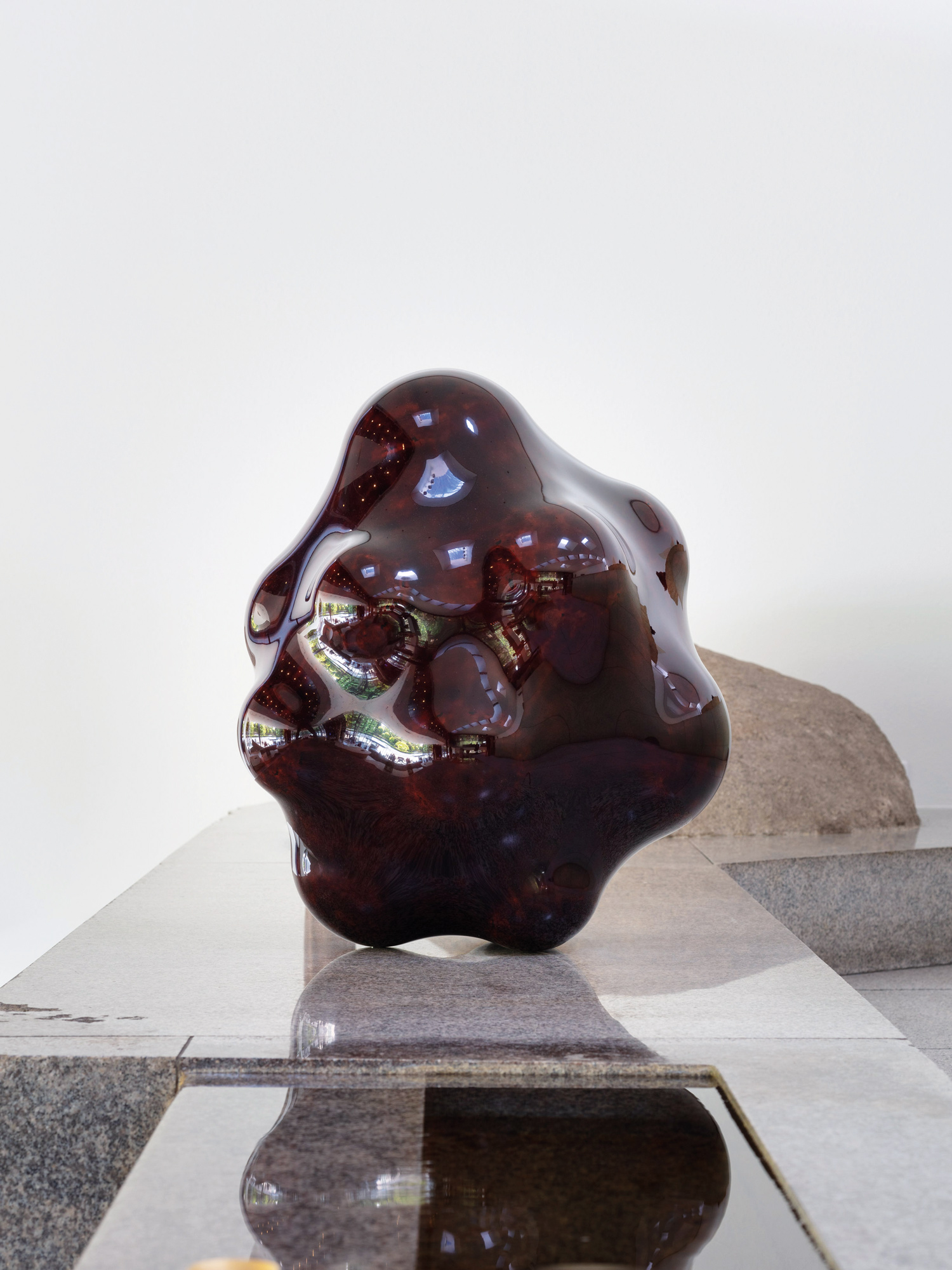
Shortly after Hedi Slimane’s appointment as Creative Director of French fashion heavyweight Yves Saint Laurent in 2012, he proceeded to court controversy by renaming its ready-to-wear line ‘Saint Laurent’ and shelving A.M. Cassandre’s iconic YSL monogram logo in favour of a simple textual rendition, ‘SAINT LAURENT/ PARIS’, set in Helvetica Neue Bold. Many decried the rebrand as an egoistic erasure of not only YSL’s origins, but also its eponymous co-founder and designer. Long-time stockist Colette parodied the new logo with shirts reading ‘AIN’T LAURENT/ WITHOUT YVES’; Saint Laurent retaliated by retracting their stock, starting a three-year cold war. Critics worried that this would spell the end for the house.
Seeing as Saint Laurent has not burnt to the ground, we can now admit that Slimane’s bold strategy has paid off. Referencing the historic ‘Saint Laurent Rive Gauche’—YSL’s original ready-to-wear line, the first of its kind—and utilising the iconic, retro-modern Helvetica, Slimane’s logo drew a new trajectory from the house’s storied past towards a future ready for his making, allowing Saint Laurent to move past sophisticated women’s couture to youth, edginess and glamour. Saint Laurent’s successful gamble set a precedence for other high-end fashion houses to shed their skins and rethink their brand identities. Balmain, Diane von Furstenberg, Berluti and most recently Burberry have all embraced the minimal sans-serif to varying degrees. Even labels like Balenciaga and Calvin Klein, already branded in sans-serif, have revamped their logos to project a contemporary image.
On the surface, these type-only logos are easily dismissed as lacklustre and generic. Critics argue that replacing graphic logos with typography obfuscates a luxury brand’s heritage and personality in visual branding, leaving nothing beyond its name to differentiate it from numerous others adopting similar sans-serif tactics. When the goal of logo design is the creation of an instantly recognisable identity, why are luxury fashion houses moving contrary to that instinct, not only eliminating graphic elements but adopting typefaces with quiet personalities in their logos?
The layperson rarely encounters a naked typeface. Our typical interaction with typefaces is through lengths of text, messages and directions and names, cushioned in context and blanketed in colour. Typefaces are tools for conveying information, not merely through the spelling out of words, but also in the suggestion of character and history by a typeface’s form. Even sans-serifs, engineered for efficiency, harbour distinct dispositions and potential conceptual implications to be surfaced.
As a family, sans-serifs demonstrate the kind of minimal efficiency prized by modern design, easily balancing communication and legibility, while displaying enough subtle distinction between typefaces for designers to leverage. Most of the commonly used sans-serifs today bear association to the International Typographic Style, which sought the representation of information objectively through rational geometric executions. Subsequently, through the development of further modernist graphic and design movements such as Bauhaus, where the sans-serif was further distilled, rationalised and exercised to reflect modernist design principles, the sans-serif family has come to embody and imply clean, minimal efficiency. Easily balancing communication and legibility, while displaying enough subtle distinction between typefaces to leverage upon, sans-serifs are suited to relaying and supporting messages without stealing attention from the content. Perhaps counter to their original intent, sans-serifs dating from the modernist era have, through years of use, developed a reputation of steadfastness, accessibility and professionalism. This brand of modernism, while tested, is yet to be outdated—as exemplified by the continued widespread use of Helvetica—and thus is employable in suggesting a history of design, while still relating to the contemporary. This trait is particularly valuable to fashion houses, where the challenge of adapting to shifting landscapes in fashion lies in reconciling historic identities with present and future images.
The sans-serif’s simplicity is further accentuated through juxtaposition with the typical heritage brand logo. Most utilise serif and script typefaces, originating from or deliberately referencing previous eras, as a reminder of their heritage and expertise in craftsmanship. But when our consumption of visual information, text and even luxury goods have primarily shifted to fast-paced digital platforms, complex typefaces and logos now appear outdated and contradictory. Even natively digital entities like Google and Airbnb feel a need to iterate their already-strong logos and visual branding to suit the current graphic aesthetic, keeping themselves relevant not only in service but also in presentation.
With the potentials of the sans-serif—anonymity, efficiency, flexibility in suggesting milieus—it is understandable why fashion houses have embraced its utility as a design strategy. Unbeholden to the personality projected by a graphic logo or complicated typeface, a house’s product range and creative executions gain sustainable flexibility. In addressing a younger demographic of consumers hungry for luxury goods, yet favoring minimal basics and accessories, rebranding can broaden a fashion house’s market considerably. In gaining alignment with this target audience and its aesthetic, brands further access digital and social media marketing, ensuring that they are consistently relevant in the industry, and ready to brace against the future waves of change.
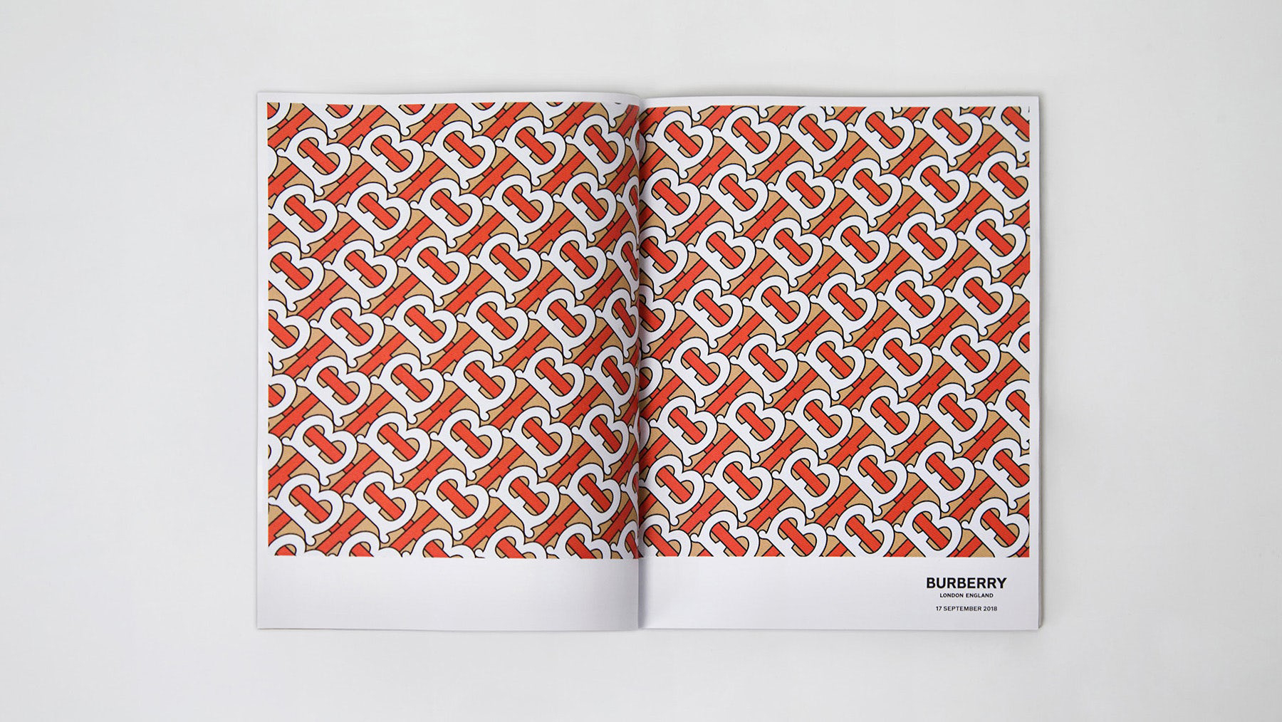
This is not to say that heritage must be abandoned; heritage can be—and is—updated to reposition a brand consistently throughout time. Storied British house Burberry, now under the direction of Riccardo Tisci, recently launched its own refresh, an endeavor Tisci undertook with prolific graphic designer Peter Saville. Saville’s approach was twofold: replacing the old ‘Prorsum knight’ logo with a sans-serif text-only version, and introducing a contemporary monogram print into Burberry’s rotation. The modern typeface holds its own graphic presence without being overwhelming, a comfortably present yet unimposing mark for Tisci’s designs. In tandem, Saville’s reinterpreted monogram serves as a clever successor to Burberry’s iconic checked pattern. Founder Thomas Burberry’s initials are interweaved interwoven in a playful diagonal lattice of white, orange and beige. The pattern’s thicker line weights, an introduction of typographical elements and even the brighter variations on Burberry’s traditional colour palette imply not a replacement, but an extended lineage to Burberry’s established identity.
Burberry’s heritage check pattern exudes a refined austerity and sophisticated utilitarianism, best exemplified in by their iconic trench coat, but the check was limited in the items it could reasonably be applied to before appearing incongruous. In contrast, the visually arresting pattern of Saville’s monogram creates its own presence, and one can anticipate various clothing and objects as its canvas—already, trams and giant inflatable teddy bears have been adorned during the rebrand launch—rather than wearing it as decoration. In anticipation of its future, and creating further distinction with its past, Burberry is currently marketing the traditional check and stripe patterns occasionally as “‘vintage’” and “‘icon’” respectively, offering these heritage patterns alongside newly monogrammed and logo-emblazoned designs.
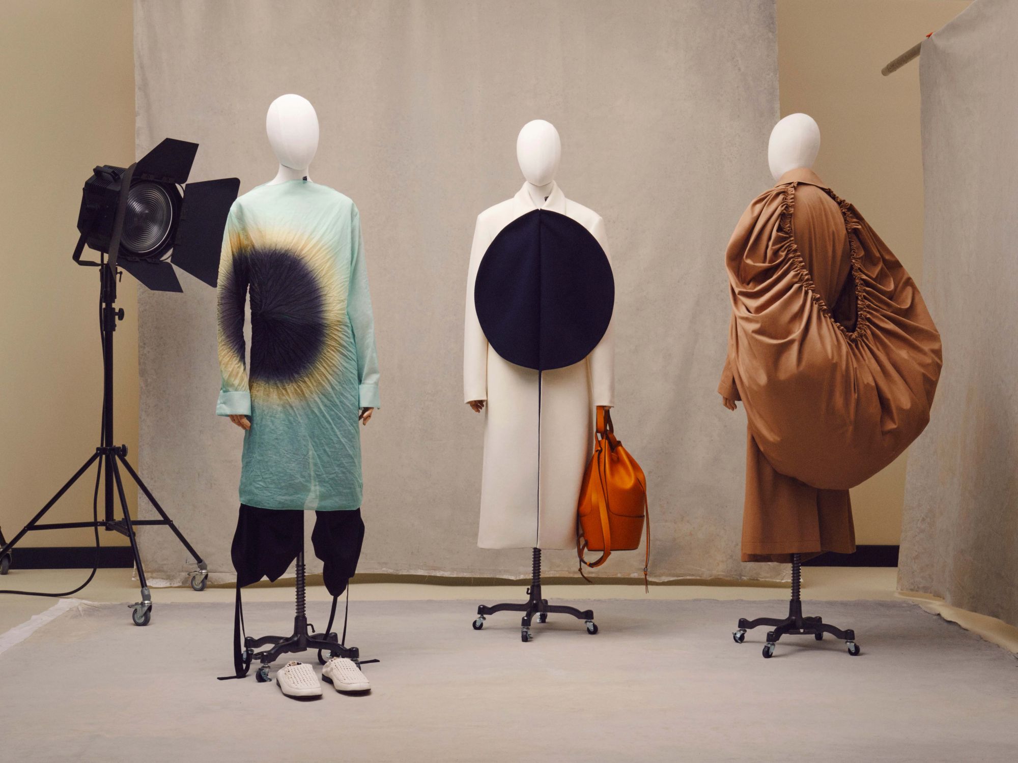
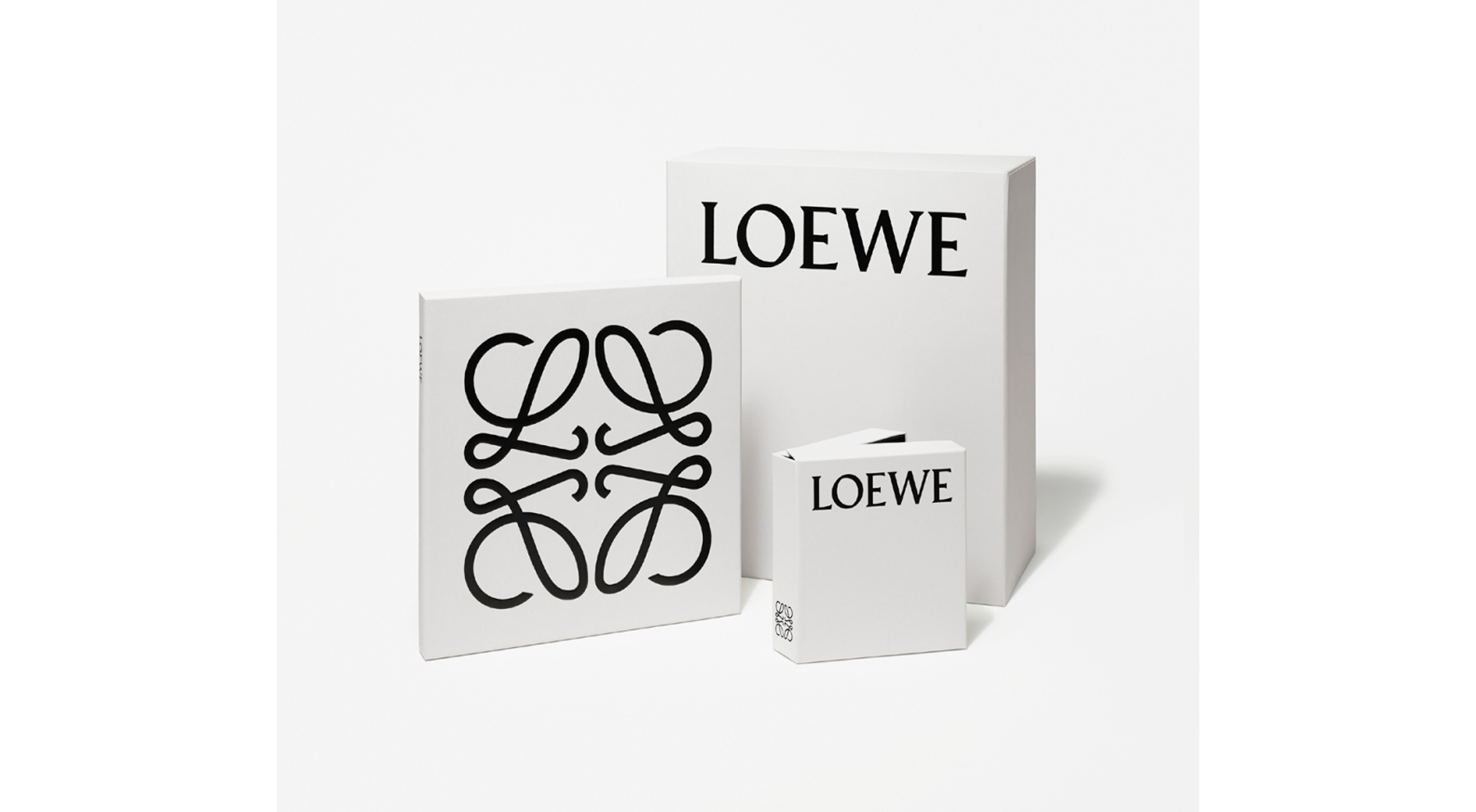
Burberry’s approach of reinterpreting heritage via monogram along with the more commonly seen sans-serif logo treatment, while effective, is not the sole answer to eliminating anachronism. Jonathan Anderson’s strategy, similar in methodology, was to update Spanish house Loewe’s logo font and rejuvenate a heritage graphic, except Anderson decided to head in the opposite chronological direction. Anderson’s chosen creative agency M/M (Paris) brought typographer Berthold Wolpe’s forgotten Pegasus serif typeface into the light for Loewe’s rebrand, recognising Wolpe’s similarities to Loewe’s namesake, craftsman Enrique Loewe Roessberg. Coupled with this homage logo reskin was a reintroduction and redesign of the brand’s Anagram insignia, derived from the house’s history as leatherworkers and a craft collective. Reminiscent of cattle brands from which the Anagram was originally based, Anderson has since introduced the embossing of this logo to his leather goods designs. The Anagram’s subtle authority as an identifying mark suits the strong geometric nature of Anderson’s designs, suggesting modern applications of traditional techniques. Along with Anderson’s launch of the Loewe Craft Prize, this rebrand is Loewe’s reaffirmation of its roots in material craft, and signals not only dedication but leadership in exploring how craft beyond its own commercial output can evolve to reflect current creative zeitgeists.
Heritage brands typically—as with Loewe and the Anagram—imbue their logos or insignias with a degree of reverence appropriate to the houses’ histories, which may then be minorly subverted to portray playfulness. But for Gucci’s Alessandro Michele, the logo is not such a sacrosanct mark; it is another visual design element open to interpretation, even within its milieu. Seeking to revitalise the then-ailing brand, Michele—alongside CEO Marco Bizzarri—resurrected the Gucci GG logo hidden away by his predecessor Frida Giannini. While other creative directors may have stopped there, Michele then proceeded to reinterpret the logo in all ways imaginable: reworking it as a heavy metalesque slogan on a tee, turning it into a knitwear pattern for socks and sweaters, inviting graffiti artist Trevor Andrew to take his turn with spray paint. Michele’s relaxed and playful treatment of a once-dated logo, his maximalist reintroduction of vintage patterns and motifs, and a seeming disregard of the separation between high fashion and streetwear gave Gucci a unique visual identity in the industry. This neo-vintage aesthetic, coupled with a strong digital marketing strategy—aspirational, aesthetically rich and unafraid of capitalising on both pop culture and social media trends—endeared Gucci particularly to a millennial audience with nostalgic yearnings and an appreciation for the ironic approach to luxury. Moving counter to recognised market strategies more focused on self-identity and aesthetic trends, Gucci created a niche for itself through a cultural approach which allows it to react to dialogue and issues fluidly, constantly staying relevant.
Having left Saint Laurent for the auspices of Céline, Hedi Slimane has once again ignited debate with another rebrand. The minor typographic changes—tighter kerning, adjusted letter forms and most noticeably, the dropped accent—may, in fact, be a graphical improvement. But the dramatic deletion and subsequent repopulation of Celine’s entire Instagram feed, in Slimane’s stylistic preference and Slimane’s new logo, almost suggests an erasure of Phoebe Philo’s decade-long tenure. While Philo’s Céline was unapologetically specific in its audience, one would be hard-pressed to call it irrelevant or tired. Philo’s ethos of addressing and celebrating women, of recognising the beauty in imperfection and her minimalistic sophistication, elevated Céline into a position of high regard which was sustained until Philo’s departure.


Where Philo’s steering of Céline was fluid and at times unpredictable, Slimane’s new direction for Celine is essentially a continuation of the path he established at Saint Laurent, necessitating a new approach for Celine. When the brand’s most celebrated designer is Slimane’s immediate predecessor, the reinvention of Celine may mean losing a valuable asset in Philo’s legacy. Already, Slimane has broken from Philo’s traditions, by introducing Celine’s inaugural menswear collection in his Spring/Summer 2019 show; perhaps this is expected, considering Slimane’s proven expertise in male fashion. But with plans for the menswear collection to be made in unisex sizing, perhaps introducing the Celine Man into the fold is more than just widening the audience; it is increasing the avenues of expression for the Celine Woman as well.
"As a form of shorthand for a house’s cultural cache, logos become not merely trademark, but potentially even the product itself."
As an instinctual and direct form of self-expression, fashion naturally progresses forward through successive milieus, aesthetically in dialogue with contemporary social concerns. As a form of shorthand for a house’s cultural cache, logos become not merely trademark, but potentially even the product itself; in such a landscape where reputation and output overlap, branding that suggests irrelevance can be damning. The spike in rebrands we have seen within the past decade is symptomatic of the industry’s recognition that our understanding of and engagement with luxury is shifting, more rapidly than it has before. Despite similar methods of transformation being employed across multiple houses, rather than birthing homogeneity, this adaptation facilitates the rediscovery and affirmation of a brand’s unique heritage as the crux of its identity, while still reflecting the zeitgeist. That is how storied houses are built, and how they remain standing throughout history.
