Loewe: Examining a Rebrand
by Tan Qian Rou
by Tan Qian Rou
At the core of fashion, has always been a question of identity. Its verbal root comes from the Latin facere which refers to an act: ‘to do, to make’. But fashion as we understand it today is cemented in Middle English, referring not only to the act of creation and what is made, but also to its appearance. Not simply in the visual sense, but in an emergence of dialogue, about the choice of the wearer.
Appearing is the primary function and draw of fashion: a materialization of stories and allegiances, each one stitched into hemlines and collars. From the craftsmanship and design process to the materials used and through to its presentation, everything accumulates within a single piece of clothing, lending itself to a narrative that is being weaved, and will finally frame the person wearing it. You wear who you are.
As with any industry or art, fashion is not a solitary endeavor. It is dependent on those who wear it, just as they rely on the gravitas of fashion to craft an identity, a statement and a community. Fashion brings members of a similar culture together, but it also separates various groups, whether through aesthetic, workmanship or manifesto. It is a necessary process, both in economics and creativity. This sensibility naturally applies to the various houses that currently exist: each brand, with their own philosophies and audiences must distinguish themselves, but may only do so by rallying around an icon.
The iconic woman, a quintessential scent, the signature silhouette; each house has a classical canon, a collection of items and images which bear within their image the tradition, heritage and vision established and upheld over the years. But the greater, more complex and more diverse a brand grows, the harder it is to achieve a coherence in representation, particularly through the seasons of time. And so, acting as the necessary keystone to the canon of a brand is the literal icon, the logo.
Naturally, both pros and cons exist. The logo defines a central aesthetic around which the rest of the brand’s visual identity may be established. Not simply through advertisement campaigns and letterheads, but also through the fashion itself, in the form of monograms and recurring motifs. Houses identify themselves through their logos, but occasionally, this lures them into a cycle of stagnation. When creative repetition becomes a problem, they are forced to reexamine their brand identity and sometimes, reinvent it. Saint Laurent is a dramatic, but not singular example of rebranding among fashion houses in recent years: many others have altered their appearance to some extent, as Christopher Bailey has done for Burberry.
Yet, while creative directors change hands and new directions are taken, no brand has ventured as far as to modify the iconography which identifies them with their audience. No brand, that is, until Loewe.
Just as with Slimane and Bailey, it begins with a single man. In September of 2013, Jonathan Anderson, of his famed, eponymous label J.W. Anderson, was named as the new creative director of Loewe. Anderson’s appointment is part of the Spanish leather goods brand’s steady process of reinventing its identity, which seeks to move out of a traditional aesthetic and into a more modern cultural landscape. Anderson, who is typically known for his controversial, bold work, is to lead Loewe into a new era. His intended focus is a streamlining of design, with a new emphasis on functionality and materiality mediated through modern forms.
In order to construct this new universe, Anderson faces one critical challenge: to redefine the way in which Loewe is to be rationalized, both externally to consumers but also internally, setting the foundation for his vision. Intuitively, the first object of reinterpretation must be the logo. Loewe’s iconic ‘Anagram’ logo, conceived in 1970 by Spanish painter Vicente Vela, takes its roots from the branding irons used to mark cattle, a nod to Loewe’s tradition of leatherwork. Vela’s Anagram and its accompanying logotype asserts Loewe’s heritage, but its archaic flourishes and strong serifs prevent a smooth transition into modern design.
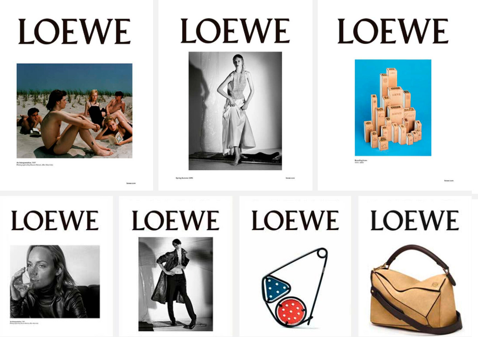
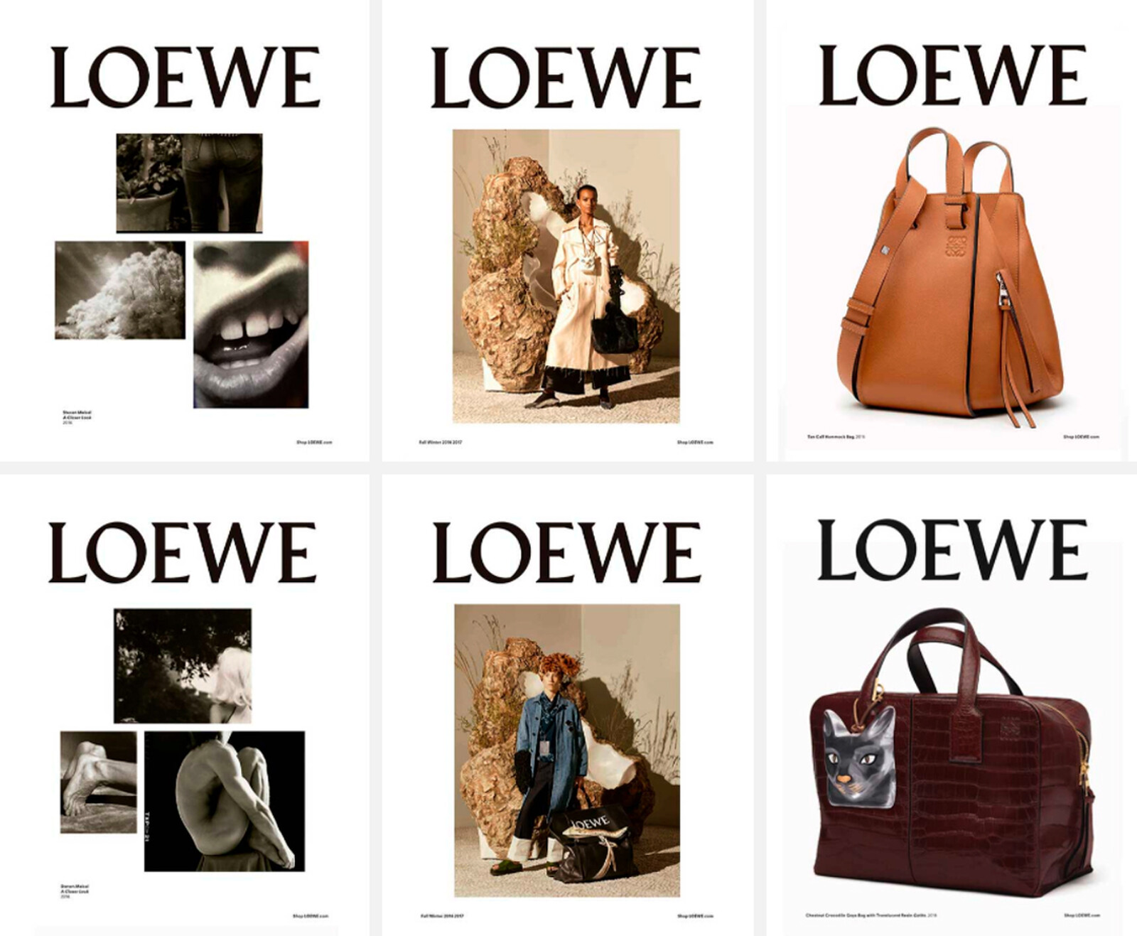
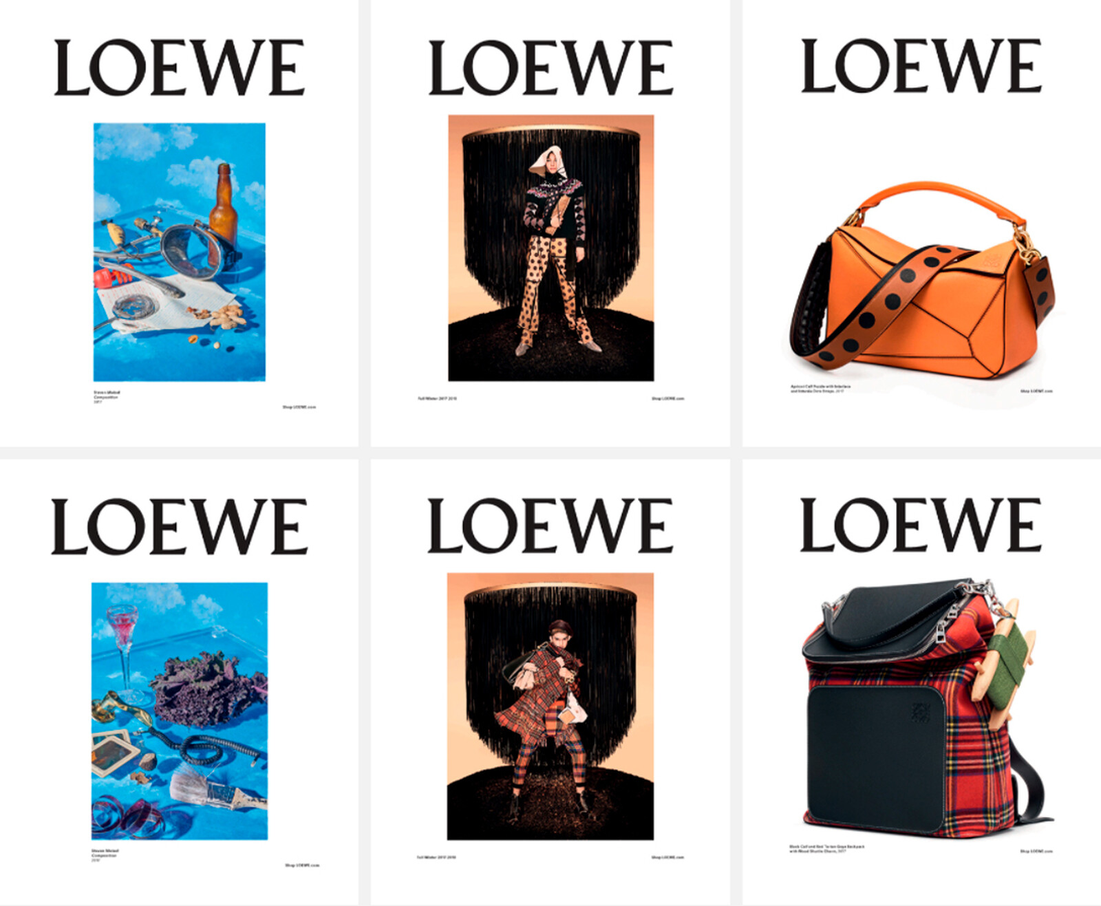
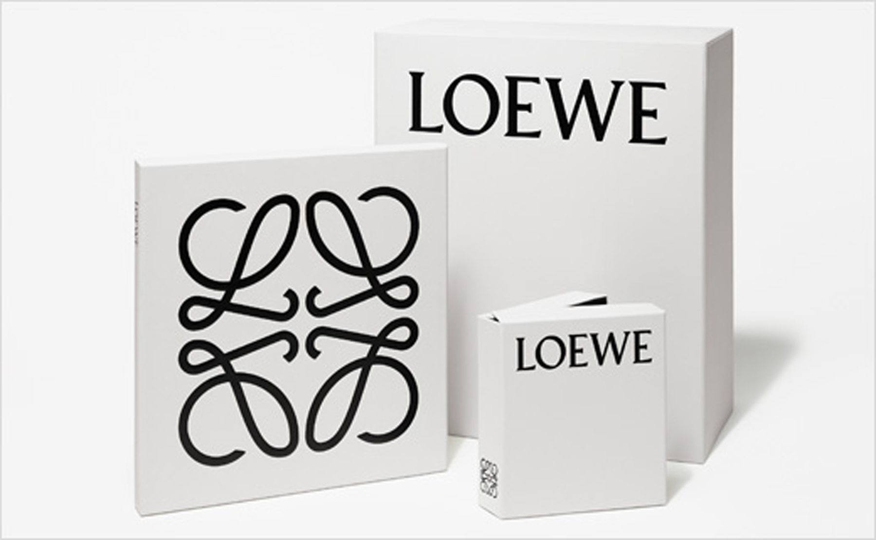
Enter M/M (Paris), the wunderkind team of Mathias Augustyniak and Michael Amzalag. Loewe commissioned the duo to create a new graphic identity for the brand’s remaking. M/M (Paris) chose to retain and pare down the existing logo and logotype instead of mounting a complete overhaul as Loewe has done several times throughout the past 70 years. The Anagram has been minimalized of all flourish, retaining its elegance while eliminating visual complications. The font of the logotype, initially set in Bembo, has been replaced by German-born typographer Berthold Wolpe’s Pegasus, a nod to Enrique Loewe Roesseberg’s Germanic origins. These adorn the face of Loewe’s new packaging, colored in a faintly smoky white.
M/M (Paris)’s decision to rework the individual elements of Loewe’s graphic identity rather than implement a complete change, as was conventional with Loewe, is crucial: moreso than preserving its heritage, the continuity of Loewe’s imagery is kept unbroken even as Anderson moves the Spanish house into new territory. It is not the theatrical rebrand that Slimane staged for Saint Laurent, but for Loewe, with its strong emphasis on tradition, it is a bold enough move. Loewe is able to retain its place within the cultural context it has cultivated, while providing enough of a visual change to signify a distinct shift in direction. Different, yet familiar.
For its Spring/Summer 2015 ad campaign, Anderson juxtaposes vintage ads from Loewe’s archives with his new designs, which are refreshingly sleek. The new logo lends itself well to Anderson’s hand: it is enough of a statement without being ostentatious and loud, a quiet monogram which speaks of confidence rather than a proclaimation. Anderson’s transformation of Loewe is guided by a single statement: ‘Past, Present and Future’. It is a perfect summation of his desire for Loewe, an earnest acknowledgement and reverence for its heritage, with the capability of addressing the contemporary zeitgeist of fashion. Most importantly, Loewe’s new iconography creates an opportunity, for Anderson to mount a currently undefined exploration of Loewe’s future, uninhibited by the past.
